
탭 네비게이션 활용 및 설정 법은 이전 글 포스팅으로 확인하세요
2022.07.17 - [Mobile/React Native] - 리액트 네이티브 X EXPO 탭 네비게이터 설정 및 TabNavigator 사용방법을 알아보자
리액트 네이티브 X EXPO 탭 네비게이터 설정 및 TabNavigator 사용방법을 알아보자
탭 내비게이터란? 여러 앱들이 아래의 UI를 많이 채택해서 사용하고 있습니다 탭이라는 하단 영역에 직관적인 아이콘을 사용함으로써 페이지 이동을 보다 자유롭게 하게 함입니다 스택 내비게
tantangerine.tistory.com
메인 페이지에는 많은 이미지들이 존재합니다
이처럼 이미지가 많은 페이지라면 이미지가 지연없이 부드럽게 호출할 수 있게
react-native-image-blur-loading 라이브러리를 사용하도록 하겠습니다
라이브러리를 다음과 같이 추가합니다
yarn add react-native-image-blur-loading
메인페이지 구성 및 배너카드 구성하기
mainPage를 아래와 같이 코드를 작성합니다
메인페이지에 Grid 컴포넌트를 사용해서 메인에서 한개의 배너카드를 구현할 수 있습니다
이렇게 로고 배너를 삽입하여 어떠한 정보를 노출할 수 있습니다
CardComponent에 적용하는 것이 아니라
메인에 적용하여 단발적인 배너카드만 적용하게된다

import React from 'react';
import { StyleSheet, View } from 'react-native';
import { Col, Grid } from 'react-native-easy-grid';
import { Container, Content, Icon, Text } from 'native-base';
import CardComponent from '../components/CardComponent';
import HeaderComponent from '../components/HeaderComponent';

const data = require('../data2.json');
export default function MainPage({ navigation }) {
  return (
    <Container>
      <HeaderComponent />
      <Content>
        <Grid style={styles.banner}>
          <Col size={1} style={{ padding: 20 }}>
            <Icon name="paper-plane" style={{ color: 'deeppink' }} />
          </Col>
          <Col size={6} style={{ padding: 15 }}>
            <Text>이야기 하고 싶은 친구들에게</Text>
            <Text style={{ fontWeight: '700' }}>wegram을 전하세요</Text>
          </Col>
        </Grid>
        <Grid style={{ padding: 20 }}>
          <Text style={{ color: 'grey' }}>FROM THE DIARY</Text>
        </Grid>
        <View style={{ marginTop: -20 }}>
          {data?.diary?.map((content, i) => {
            return (
              <CardComponent
                content={content}
                key={i}
                navigation={navigation}
              />
            );
          })}
        </View>
      </Content>
    </Container>
  );
}

const styles = StyleSheet.create({
  banner: {
    backgroundColor: '#F6F6F6',
    height: 70,
    borderRadius: 10,
    width: '90%',
    alignSelf: 'center',
  },
});
구조는 네이티브 베이스를 사용해서 Grid, Col 사용한것을 확인 할수 있습니다.
또 한,
CardComponent, HeaderComponent를사용하여 아래와 같이 구현하게됩니다.
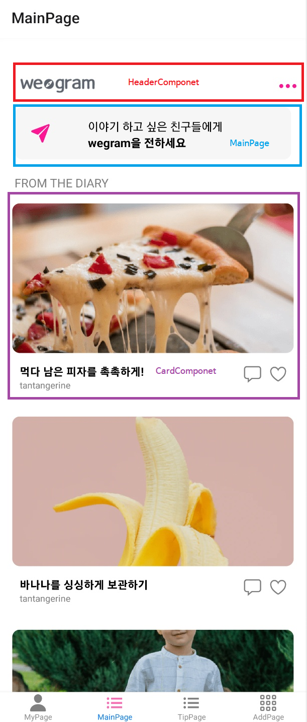
헤더컴포넌트에 대한 코드는 아래와 같습니다.
네이티비 베이스의 Header컴포넌트를 사용하여
transparent의 속성을 부여하여 배경색을 제거합니다.
여기에서 중요 포인트는 Left, Right를 사용하여
왼쪽에는 로고와 오른쪽에는 토글이미지의 설정기능할 수 있는 영역을 지정합니다
이것으로 HeaderComponent 구성은 쉽게 끝낼 수 있습니다.
HeaderComponent 구성하기

import React from 'react';
import { StyleSheet, Image, View } from 'react-native';
import { Header, Left, Icon, Right, Text, Button } from 'native-base';

const logo = require('../assets/logo.png');

export default function HeaderComponent() {
  return (
    <Header transparent>
      <Left>
        <Button transparent>
          <Image source={logo} style={styles.logoImage} />
        </Button>
      </Left>
      <Right>
        <Icon name="ellipsis-horizontal" style={{ color: 'deeppink' }} />
      </Right>
    </Header>
  );
}

const styles = StyleSheet.create({
  logoImage: { width: 100, resizeMode: 'contain', marginLeft: 10 },
});
위의 코드는 HeaderComponent 입니다.
CardComponent 구성 및 ImageBlurLoading 구성하기
CardComponent는 위에 설명했듯이
ImageBlurLoading 컴포넌트를 사용하였습니다
이미지를 부드럽게 호출할 수 있는 라이브러리 입니다
ImageBlurLoading 속성에
thumbnailSource는 이미지가 로딩될때 보여지는 이미지를 출력합니다
withIndicator는 이미지로딩시 로딩중이라고 알려주는 기능입니다
source는 이미지 데이터입니다
이때 ImageBlurLoading 컴포넌트는 CardItem에 사용하여 한개의 이미지를 컴포넌트로 생각한다
그리고 CarItem은 Card에서 CarItem을 사용하여 영역을 지정하여
편리하게 이미지를 구현할 수 있습니다
import React from 'react';
import { StyleSheet, Image, TouchableOpacity } from 'react-native';
import { Col, Row, Grid } from 'react-native-easy-grid';
import { Icon, Text, Card, CardItem } from 'native-base';
const image = require('../assets/background2.png');
const logo = require('../assets/logo.png');
import ImageBlurLoading from 'react-native-image-blur-loading';

export default function CardComponent({ navigation, content }) {
  return (
    <TouchableOpacity
      onPress={() => {
        navigation.navigate('NewDetailPage', { content: content });
      }}
      style={styles.container}
    >
      <Card style={styles.card} transparent>
        <CardItem transparent>
          <ImageBlurLoading
            withIndicator
            thumbnailSource={{ uri: content?.image }}
            source={{ uri: content?.image }}
            style={styles.image}
          />
        </CardItem>
        <CardItem style={{ marginTop: -10 }}>
          <Grid>
            <Col size={9}>
              <Text numberOfLines={1} style={styles.title}>
                {content.title}
              </Text>
              <Text style={[styles.grey, styles.writer]}>{content.author}</Text>
            </Col>
            <Col size={2}>
              <Grid>
                <Col>
                  <Icon name="chatbox-outline" style={styles.grey} />
                </Col>
                <Col>
                  <Icon name="heart-outline" style={styles.grey} />
                </Col>
              </Grid>
            </Col>
          </Grid>
        </CardItem>
      </Card>
    </TouchableOpacity>
  );
}

const styles = StyleSheet.create({
  container: { alignItems: 'center', alignSelf: 'center' },
  card: {
    width: '100%',
    alignSelf: 'center',
  },
  image: { height: 200, width: '100%', borderRadius: 10 },
  grey: { color: 'grey' },
  writer: { fontSize: 12, color: 'grey', marginLeft: 10 },
  title: { fontWeight: '700', fontSize: 15, marginLeft: 10 },
});
이렇게 메인페이지를 구현해보았습니다
이번에는 CardComponent의 ImageBlurLoading과 CarItem을 활용하였습니다
CarItem은 사이드 메뉴의 Expo의 공식문서를 보면서 더욱 활용도를 높여보세요
언제나 배우면 배울수록 끝이 없는것같다고 생각이 드네요
화이팅 하시고 힘내세요!!
아직 우리의 IT대모험은 끝나지 않았으니까요!!
파이팅!

'Mobile > React_Native' 카테고리의 다른 글
| React Native X Expo 데이터 영구관리 AsyncStorage 로컬스토리지 저장 사용법 (0) | 2022.07.22 |
|---|---|
| React_Native X Expo 앱에 애드몹 활용해서 구글 광고 노출하기 (0) | 2022.07.19 |
| 리액트 네이티브 X EXPO 탭 네비게이터 설정 및 TabNavigator 사용방법을 알아보자 (0) | 2022.07.17 |
| 리액트 네이티브 태그 스타일을 도와주는 NativeBase 라이브러리 활용법 (0) | 2022.07.12 |
| React Native Share와 Expo_Linking 활용해서 공유, 외부링크 기능 구현하기 (0) | 2022.07.05 |