
728x90
반응형
View, ScrollView, Text, Button, Image 엘리먼트 & 태그 활용
<View> 엘리먼트 활용
- 화면의 영역(레이아웃)을 잡아주는 엘리먼트이다.
- App.js 상에서 View는 화면 전체 영역을 가진다.
- 아래와 같이 화면을 분할할 수 있다.
import { StatusBar } from 'expo-status-bar';
import React from 'react';
import { StyleSheet, Text, View } from 'react-native';

export default function App() {
  return (
    <View style={styles.container}>
      <View style={styles.subContainerOne}></View>
      <View style={styles.subContainerTwo}></View>
    </View>
  );
}

const styles = StyleSheet.create({
  container: {
    flex: 1,
    backgroundColor: '#fff',
  },
  subContainerOne: {
    flex:1,
    backgroundColor:"yellow"
  },
  subContainerTwo: {
    flex:1,
    backgroundColor:"green"
  }
});- 각 태그들에는 style이라는 속성을 가지고 있다
- 속성은 하단에 스타일 코드 객체의 키값을 할당하여 엘리먼트에 스타일을 부여한다
View호 화면을 분할하고 영역을 나누려면
스타일 문법(StyleSheet)과 같이 사용해야 한다
스타일 문법(StyleSheet)은 다음 포스팅에서 확인하고
View는 화면의 영역을 잡는 엘리먼트라는 것만 알아두자
아래의 이미지는 위의 코드로 표현한 앱 화면이다
상위 View엘리먼트 안에 하위 2개의 View 엘리먼트로 인해 2개의 영역이 표현된다.

<ScrollView> 엘리먼트 활용
- 앱 화면에 노출되는 영역보다 엘리먼트가 벗어나면 ScrollView 엘리먼트를 사용하면 스크롤이 가능하다
import React from 'react';
import { StyleSheet, Text, View, ScrollView } from 'react-native';

export default function App() {
  return (
    <ScrollView style={styles.container}>
      <View style={styles.textContainer}>
        <Text style={styles.textStyle}>영역을 충분히 갖는 텍스트 입니다!</Text>
      </View>
      <View style={styles.textContainer}>
        <Text style={styles.textStyle}>영역을 충분히 갖는 텍스트 입니다!</Text>
      </View>
      <View style={styles.textContainer}>
        <Text style={styles.textStyle}>영역을 충분히 갖는 텍스트 입니다!</Text>
      </View>
      <View style={styles.textContainer}>
        <Text style={styles.textStyle}>영역을 충분히 갖는 텍스트 입니다!</Text>
      </View>
      <View style={styles.textContainer}>
        <Text style={styles.textStyle}>영역을 충분히 갖는 텍스트 입니다!</Text>
      </View>
      <View style={styles.textContainer}>
        <Text style={styles.textStyle}>영역을 충분히 갖는 텍스트 입니다!</Text>
      </View>
      <View style={styles.textContainer}>
        <Text style={styles.textStyle}>영역을 충분히 갖는 텍스트 입니다!</Text>
      </View>
    </ScrollView>
  );
}

const styles = StyleSheet.create({
  container: {
    flex: 1,
    backgroundColor: '#fff',
  },
  textContainer: {
    height:100,
    borderColor:'#000',
    borderWidth:1,
    borderRadius:10,
    margin:10,
  },
  textStyle: {
    textAlign:"center"
  }
});
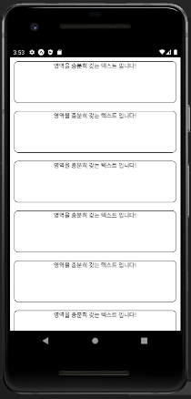
상위 엘리먼트를 View로 구현했다면 마지막 부분이 짤려서 보이질 않는다.
ScrollView를 사용하면 스크롤이 가능해지면서 마지막부분도 보이게된다.
반응형
<Text> 엘리먼트 활용
- 앱에 글을 표현하려면 꼭 사용해야 할 엘리먼트이다.
- 방금 전 위에서 배운 ScrollView 엘리먼트 안에 문자를 작성하면 오류가 발생한다.
import React from 'react';
import { StyleSheet, Text, View } from 'react-native';

export default function App() {
  return (
    <View style={styles.container}>
      <Text>문자는 Text 태그 사이에 작성!!</Text>
      <Text>문자는 Text 태그 사이에 작성!!</Text>
      <Text>문자는 Text 태그 사이에 작성!!</Text>
      <Text>문자는 Text 태그 사이에 작성!!</Text>
      <Text>문자는 Text 태그 사이에 작성!!</Text>
      <Text>문자는 Text 태그 사이에 작성!!</Text>
      <Text>문자는 Text 태그 사이에 작성!!</Text>
      <Text>문자는 Text 태그 사이에 작성!!</Text>
      <Text>문자는 Text 태그 사이에 작성!!</Text>
      <Text>문자는 Text 태그 사이에 작성!!</Text>
      <Text>문자는 Text 태그 사이에 작성!!</Text>
    </View>
  );
}

const styles = StyleSheet.create({
  container: {
    flex: 1,
    backgroundColor: '#fff',
    alignItems: 'center',
    justifyContent: 'center',
  },
});
<Button> 엘리먼트 활용
- Button 태그를 이용해서 손쉽게 버튼을 만들 수 있다
- Button 태그에는 title, color, onPress 등의 속성을 가지고 있는데, 속성을 잘 활용하면 여러기능을 구현할 수 있다.
import React from 'react';
import { StyleSheet, Text, View, Button, Alert } from 'react-native';

export default function App() {
  const customAlert = () => {
    Alert.alert("JSX 밖에서 함수 구현 가능!")
  }
  return (
    <View style={styles.container}>
      <View style={styles.textContainer}>
        <Text style={styles.textStyle}>아래 버튼을 눌러주세요</Text>
        <Button
          style={styles.buttonStyle}
          title="버튼입니다 "
          color="#f194ff"
          onPress={customAlert}
        />
        <Button
            style={styles.buttonStyle}
            title="버튼입니다 "
            color="#FF0000"
            onPress={() => {customAlert()}}
          />
          </View>
    </View>
  );
}

const styles = StyleSheet.create({
  container: {
    flex: 1,
    backgroundColor: '#fff',
  },
  textContainer: {
    height:100,
    margin:10,
  },
  textStyle: {
    textAlign:"center"
  },
});
위의 코드는 Button 태그에 onPress 속성을 부여하여 앱화면 버튼영역 터치시 얼럿창을 노출하는 기능을 구현한 것이다
함수는 ES6문법인 화살표 함수를 사용해도 된다.
하지만 Button 태그는 자신의 영역을 갖기때문에 스타일을 부여하기가 어려움이 있다.
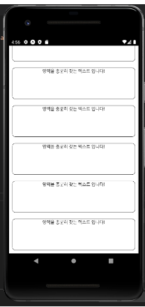
아래의 코드 처럼 ScrollView에서 카드 형식으로 만든 앱 화면이면 Button 태그를 사용하기 어렵다 그러므로 <TouchableOpacity> 태그를 활용하면 화면에 영향을 주지않고 쉽게 구현할 수 있다.
<TouchableOpacity> 태그를 활용해서 Button 태그 대체하기
- <ScrollView> 상위 태그로 하위태그는 View를 사용하지만 그것을 TouchableOpacity태그로 대체하면 임의의 영역과 디자인에 버튼 기능을 구현하고 싶을경우 주로 사용한다
import React from 'react';
import { StyleSheet, Text, View, ScrollView, TouchableOpacity, Alert } from 'react-native';

export default function App() {
  const customAlert = () => {
    Alert.alert("TouchableOpacity에도 onPress 속성이 있습니다")
  }
  return (
    <ScrollView style={styles.container}>
      <TouchableOpacity style={styles.textContainer} onPress={customAlert}>
        <Text style={styles.textStyle}>영역을 충분히 갖는 텍스트 입니다!</Text>
      </TouchableOpacity>
      <TouchableOpacity style={styles.textContainer} onPress={customAlert}>
        <Text style={styles.textStyle}>영역을 충분히 갖는 텍스트 입니다!</Text>
      </TouchableOpacity>
      <TouchableOpacity style={styles.textContainer} onPress={customAlert}>
        <Text style={styles.textStyle}>영역을 충분히 갖는 텍스트 입니다!</Text>
      </TouchableOpacity>
      <TouchableOpacity style={styles.textContainer} onPress={customAlert}>
        <Text style={styles.textStyle}>영역을 충분히 갖는 텍스트 입니다!</Text>
      </TouchableOpacity>
      <TouchableOpacity style={styles.textContainer} onPress={customAlert}>
        <Text style={styles.textStyle}>영역을 충분히 갖는 텍스트 입니다!</Text>
      </TouchableOpacity>
      <TouchableOpacity style={styles.textContainer} onPress={customAlert}>
        <Text style={styles.textStyle}>영역을 충분히 갖는 텍스트 입니다!</Text>
      </TouchableOpacity>
      <TouchableOpacity style={styles.textContainer} onPress={customAlert}>
        <Text style={styles.textStyle}>영역을 충분히 갖는 텍스트 입니다!</Text>
      </TouchableOpacity>
    </ScrollView>
  );
}

const styles = StyleSheet.create({
  container: {
    flex: 1,
    backgroundColor: '#fff',
  },
  textContainer: {
    height:100,
    borderColor:'#000',
    borderWidth:1,
    borderRadius:10,
    margin:10,
  },
  textStyle: {
    textAlign:"center"
  }
});
<Image> 태그 활용해서 앱화면에 이미지를 노출하자
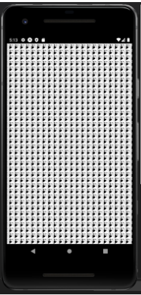
- 내부 폴더 안에있는 이미지를 사용하는 방법이 있다
- 여러 속성을 사용해서 이미지를 삽입한다
- source, resizeMode, style등 여러 속성을 활용할 수 있다.
import React from 'react';
import { StyleSheet, Text, View, Image } from 'react-native';
import favicon from "./assets/favicon.png"

export default function App() {
  return (
    <View style={styles.container}>
      <Image
        source={favicon}
        resizeMode={"repeat"}
        style={styles.imageStyle}
      />
    </View>
  );
}

const styles = StyleSheet.create({
  container: {
    flex: 1,
    backgroundColor: '#fff',
    justifyContent:"center",
    alignContent:"center"
  },
  imageStyle: {
    width:"100%",
    height:"100%",
    alignItems:"center",
    justifyContent:"center"
  }
});
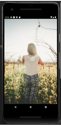
- 외부 이미지 링크를 사용하는 방식도 있다.
- 위와 다르게 resizeMode에 repeat을 cover로 변경해서 사용하였다 결과를 아래에서 확인해보자.
import React from 'react';
import { StyleSheet, Text, View, Image } from 'react-native';
import favicon from "./assets/favicon.png"

export default function App() {
  return (
    <View style={styles.container}>
      <Image
        source={{uri:'https://images.unsplash.com/photo-1424819827928-55f0c8497861?fit=crop&w=600&h=600%27'}}
        resizeMode={"cover"}
        style={styles.imageStyle}
      />
    </View>
  );
}

const styles = StyleSheet.create({
  container: {
    flex: 1,
    backgroundColor: '#fff',
    justifyContent:"center",
    alignContent:"center"
  },
  imageStyle: {
    width:"100%",
    height:"100%",
    alignItems:"center",
    justifyContent:"center"
  }
});
앱 화면을 구현하기위해 기초적인 태그들을 정리해보았다
앞으로 React Native를 활용해서 Expo와 같이 구현한다
Expo에 대한 장점과 단점은 분명하며 어떤 앱을 구현할때 Expo가 유리할지도 생각해보아야겠다
앞으로 어떤앱이 탄생할지 계속해서 만들어보자

728x90
반응형
'Mobile > React_Native' 카테고리의 다른 글
| 리액트 네이티브 X EXPO 탭 네비게이터 설정 및 TabNavigator 사용방법을 알아보자 (0) | 2022.07.17 |
|---|---|
| 리액트 네이티브 태그 스타일을 도와주는 NativeBase 라이브러리 활용법 (0) | 2022.07.12 |
| React Native Share와 Expo_Linking 활용해서 공유, 외부링크 기능 구현하기 (0) | 2022.07.05 |
| React Native_스택 네비게이션 활용 페이지와 컴포넌트 이동 (0) | 2022.07.04 |
| React Native X Expo_ 엘리먼트 & 태그에 Style 입히기 StyleSheet, Flex (0) | 2022.06.30 |